Hello again!
We have now nearly 80% of the game finished and we are relieved to see more and more of the game content becoming safe from major revisions.
Today we tackle a bit of the remaining 20%, that includes checking that the presentation of the content is good enough not to distract you or prevent you from enjoying the game.
 |
| She might, but we are still polishing it. |
Take for instance the body of text of more than 80.000 words that accounts for the backbone of our game story.
You wouldn’t want to crawl through a novel badly formatted, with an unreadable font, no matter how interesting you find the story; in the same way, you wouldn’t want to click compulsively through AoS’ dialogue, pressing ‘Continue’ just to skip an eye tiring wall of text.
This kind of revision is something that is scary, yet, there’s an exhilarating freedom in savaging in a few hours what you spent weeks to carefully create: the old fonts, the text box, the dialogue paragraphs.
One thing was sure: the old font was not working for us, nor for the ladies and gents who tested the game at demo-events like Talk&Play or Gameover 2015.
 |
| Font nightmare |
That first font was born from the need to show blocks of text up to about 600 characters, in a fixed text display box of 505×118 px.
This basically means, leaving 1/3 of the box’s height for the dialogue choices, we still have 10 lines (an average of 90 uneven characters at 4×8 px size).
At first we thought that would be ok.
We wanted a crisp pixel look with no aliasing, and we still had no decisions for the resizing of the game screen, so the first thing I did was create a bitmap font of that 4×8 px size.
The results? Passably readable at fullscreen, on a 20 inches monitor. A pain at anything less or in windowed mode.
 |
| No, no, no, no, no, no… |
Back in April, I started to look around for a Creative Commons licensed font that was suitable for commercial projects and that was also good for us. We tested more than 20 promising candidates, ranging still in the 8 to 12 pixels height area.
Some were nice, actually really nice, but very few were actually readable, in discrete quantities.
Of the readable ones, instead, pretty much none captured the feeling of cheap thrills from sci-fi crumpled pulp magazines outta the fifties, that tints the Aeon of Sands world.
At last I decided to go and create one myself, using the great tool provided for free at Fontstruct. If you are an indie developer on a budget or you just love typography, you should take a look!
 |
| Monospaced or not? Bitmap or Truetype? 8 or 16 px? So many choices… |
As soon as I started drawing the font, it was apparent that anything below 12 px compromised the readibility of our story, while, on the other hand, only fonts of 8 or 16 px scaled well with our resolution changes in game, so I settled at a 16 px font.
After three iterations, plus a minor revision, the end result is Pantella, our very own font named after the city where the game starts, well readable both in windowed and fullscreen modes.
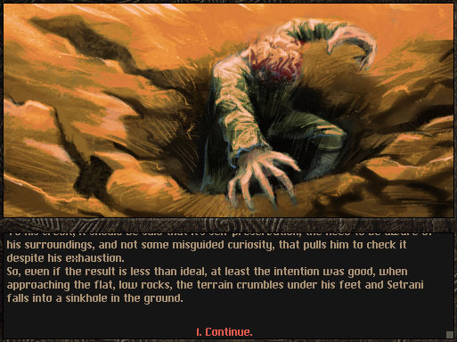 |
| Pantella. Or not a hole under our feet. |
How will it look in the new ‘cage’ of the user interface that we are implementing to meet the needs of the different monitors resolutions and ratios?
For that you’ll have to read the follow-up post of Florian in the next weeks!

Marco Pedrana, font-lover half of Two Bits Kid, artist. I want a vacation.